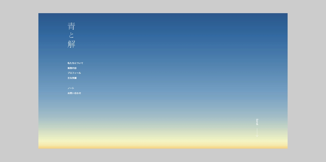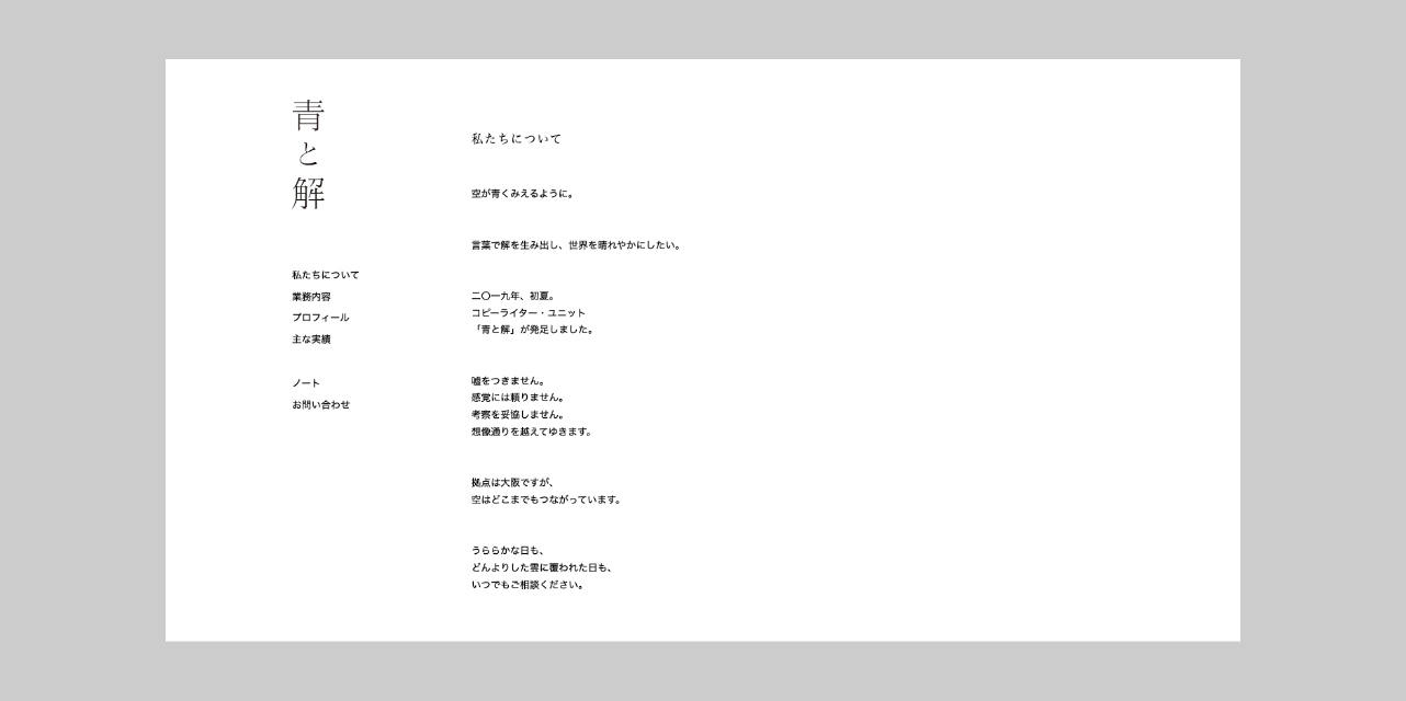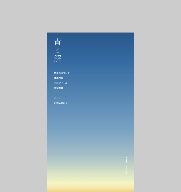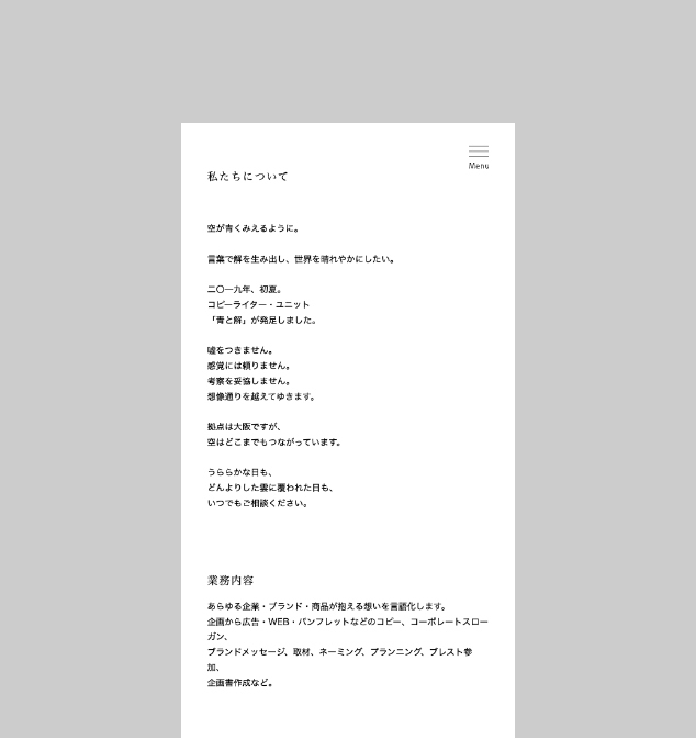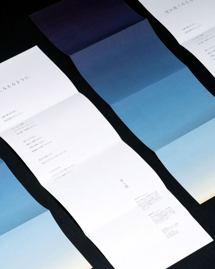
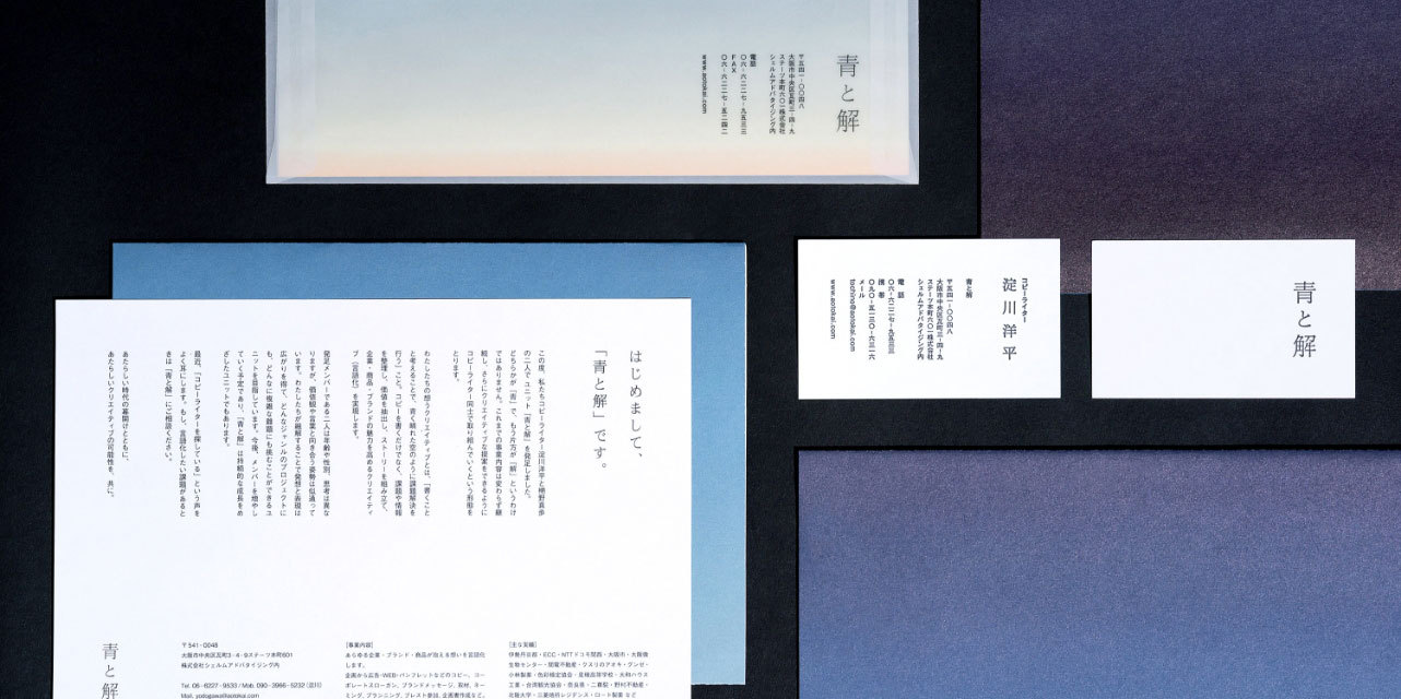
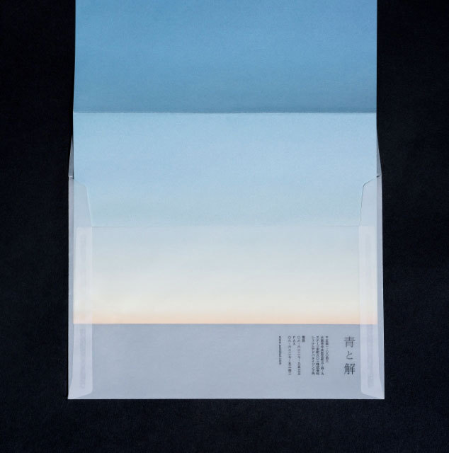
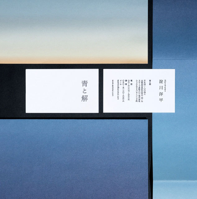
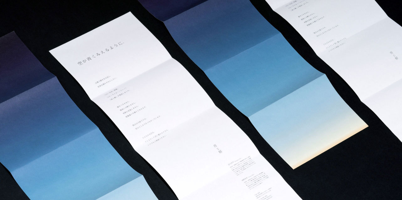
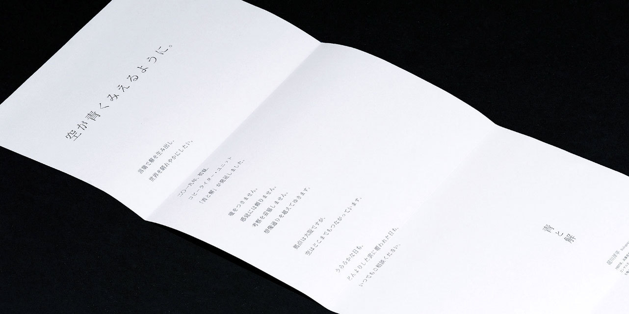
A branding project for Ao to Kai (青 means Blue, 解 means Answer), which is a copy writing duo based in Osaka.
As we were inspired by the concept “We ponder, and make things as clear as the blue sky through words.”, the visual design is presented with a gradation of blue and orange colors which is regarded as blue skies.
CI VI

Web
Web